New feature adding: Bulk buy
Integrating a Bulk Purchase Option into the Entire E-commerce Shopping Experience
Role
Product Designer
Industry
E-commerce
Duration
2 months
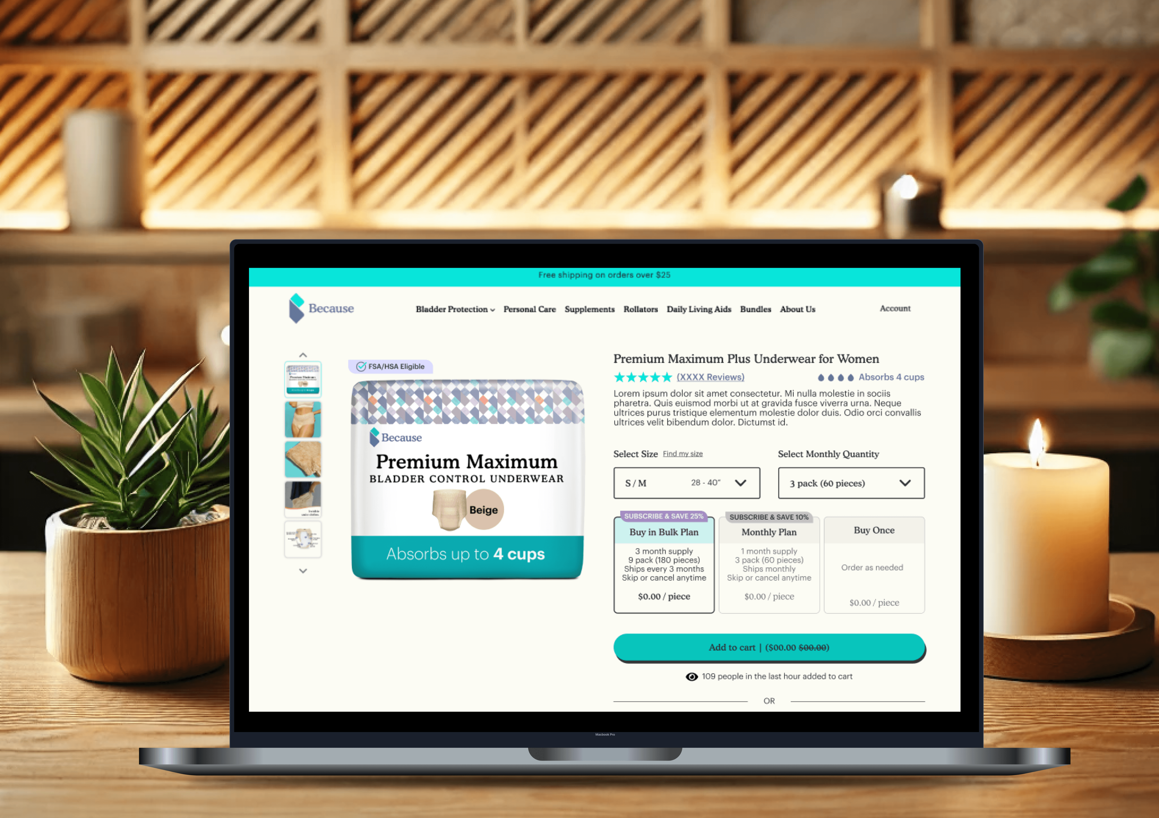
Solutions
Cart
After meeting with the marketing team, we prioritized "Monthly Subscription" and "Bulk Buy" as our main focus. However, to maintain our cart abandonment rate, we kept the "Buy Once" button as a secondary option, ensuring all customers have the flexibility to switch between purchase options.
PDP
Heatmaps revealed that 80% of users stayed within the top half of the Product Detail Page (PDP) without scrolling further. To address this, I designed a horizontal card layout that ensured key information was immediately visible and easily accessible at a glance.
Test Results
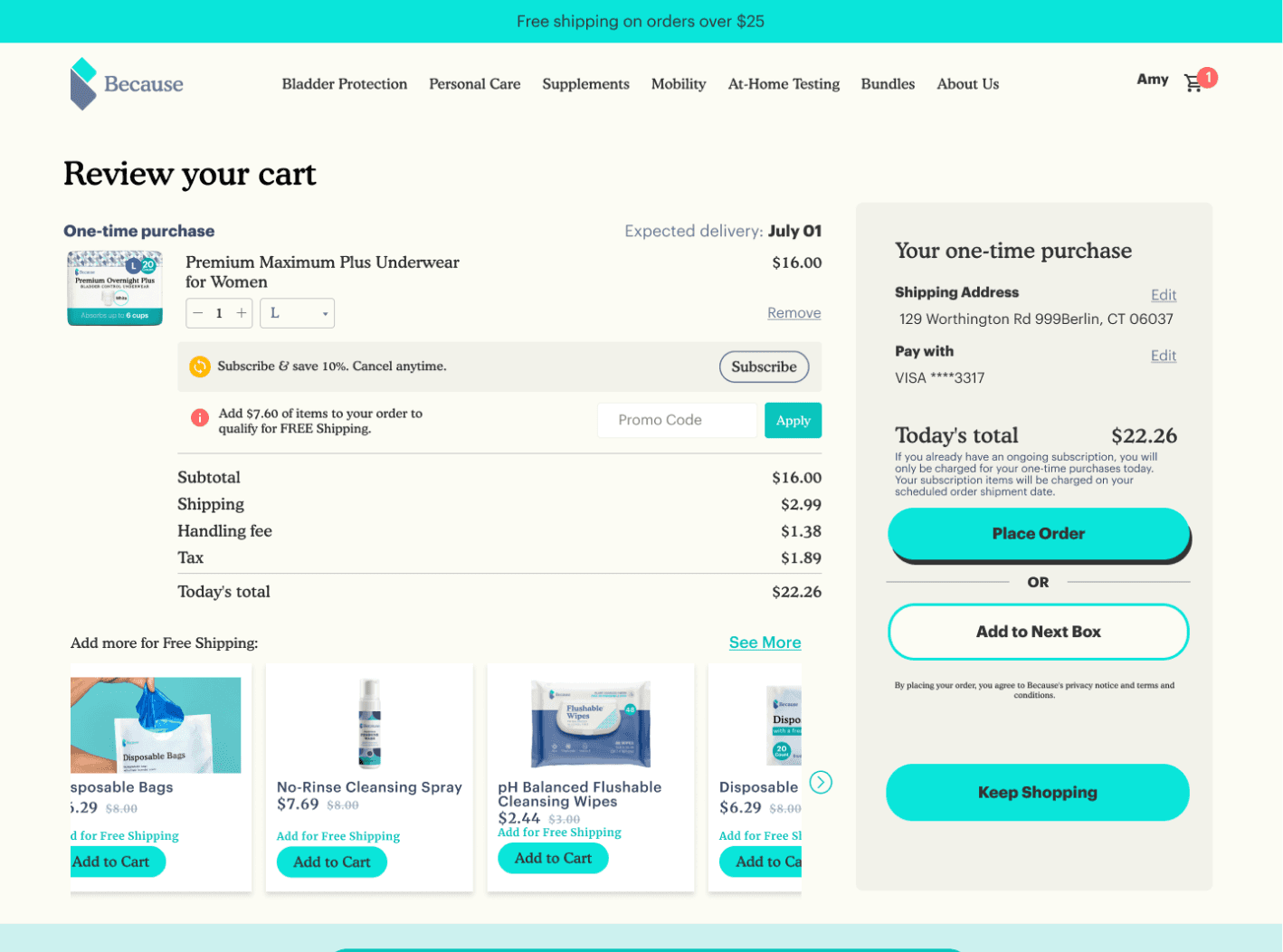
Cart
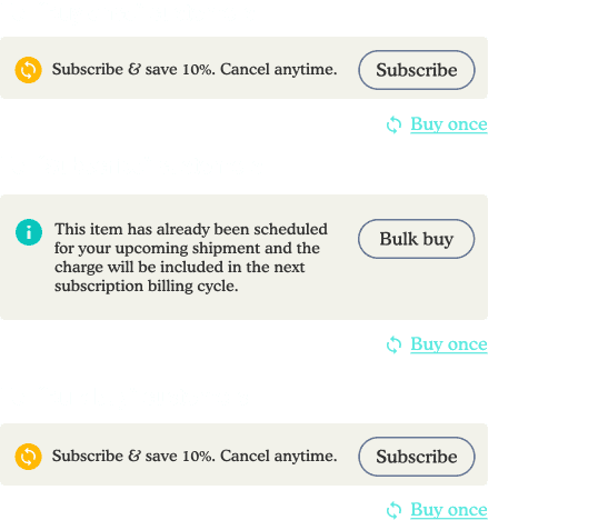
The "Buy Once" option appears somewhat inconspicuous, which may not contribute effectively to our goal of reducing the abandonment rate.
Half of the users from usertesting.com switched to “Buy once,” and most ignored “Bulk buy.”
Customers are still a bit confused.
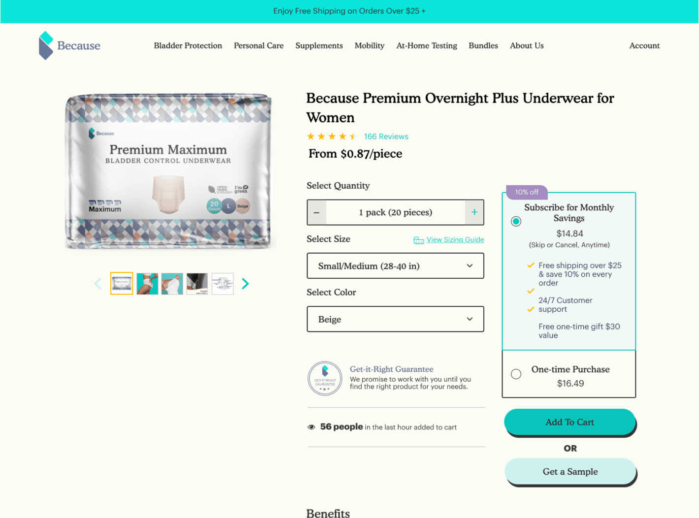
PDP
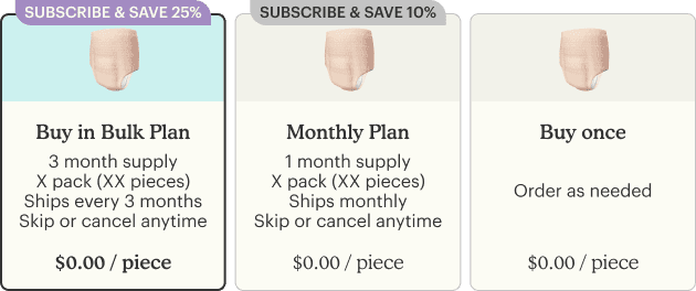
Customers clearly understand the plans, and some are willing to switch their monthly plans to Bulk Buy.
Without scrolling down to read more, customers say they get most of the information that they want.
New Version
Cart
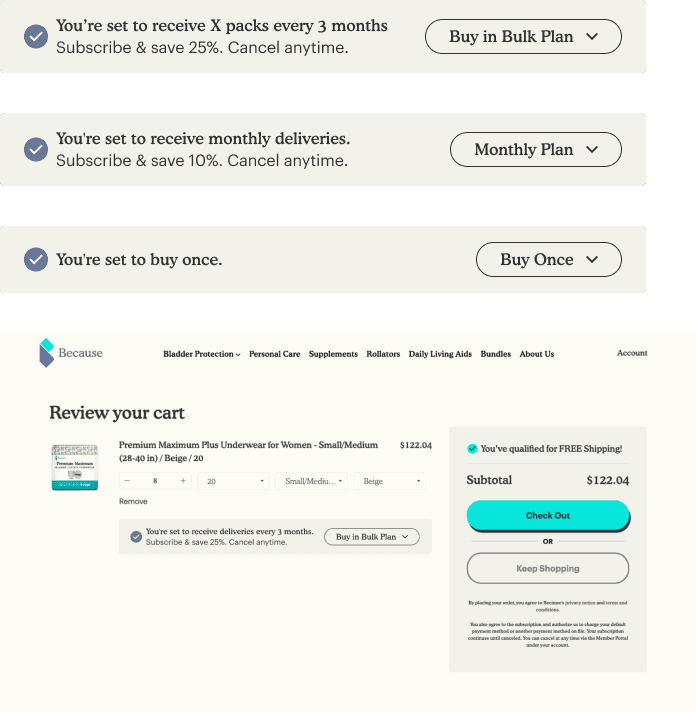
The dropdown menu reduced confusion among customers, leading to a 40% decrease in calls to modify delivery plans for 3 months.
I created a dropdown button to provide customers with a comprehensive overview of all options and to explain which plan they are currently selecting.
Customers can compare discount differences by selecting different plans.
Made the plan/discount descriptions shorter and simpler.
PDP
We got feedback from our CEO and COO:
"Why do we need the underwear picture there?"
"Can we remove it?"
So we created a new version of the cards, and did an A/B test for the 2 versions collaborated with our engineering team to launch two versions of the feature, targeting two distinct groups of customers. After the launch, I worked with the Data team to gather insights from Mixpanel to analyze the results.
Both designs performed similarly, so we opted for the simpler, no-image version to save space and reduce clutter.
What’s next?
While the introduction of 3 months-plan Bulk Buy successfully met our KPIs’ directions, further improvements were identified:
Customer Feedback: Some users expressed concerns about forgetting their plans and being charged unexpectedly.
Upcoming Enhancements: Offering new subscription options (e.g., every 15 days, every 2 months) to better match customer preferences.
Data
From our Customer support team and Data team’s summary, those are the most popular options:
Every 15 days
Every 1 month
Every 2 months
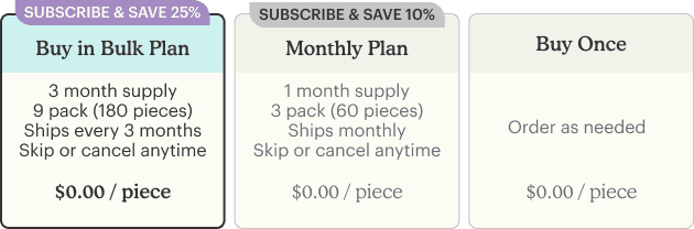
3 months supply
4 months supply
6 months supply
Final Design
To simplify the learning process, we've decided to use a dropdown box to ensure alignment between the Product Details Page, the Cart page, and the Customer Portal.
🤝 Handover the new components to our Eng team
View more details
Other projects
Redesign: Checkout experience
To improve the shopping experience, we merged the cart and checkout into a single step, eliminating the need for repeated information entry and saving customers time.
My UI works
Collaborating with a YC client to develop three products centered around voice chatting, powered by their proprietary AI chip.